So currently I use Gmail and now Blogger, both of them Google services. I've also heard of writely, which is another company that Google has bought, I guess not long ago.
Now here's the odd thing - you'd think that a company such as Google, renowned for it's web-savvy and AJAX know-how, would standardise the text entry widget across its services, taking the best features from all of them, and keeping only specific features needed by one service and not another. But no...
Instead, we have a mess of features, badly-working and feature-incomplete widgets. Google, have your wits left you?!
The Blogger interface:
 As you can see, the blogger interface is pretty basic. Although you can directly edit the HTML (which means you can do anything HTML let's you), for the basic user, the options are limited. In addition, at least on Firefox, the buttons act a bit quirky - if you double click a word and hit the button for bold, the button will remain "pressed" as you continue writing other text, although the other text is not bold!
The URL linking mechanism is incredibly simplistic, allowing you only to type an address and hit either OK or Cancel - that's it.
The picture insertion feature works okay but for some reason the pictures appear at the top of the document, instead of where the cursor currently is, and have to be drag-n-dropped (or cut-n-pasted) manually into position. And you can forget about inserting anything else, such as you can in a Word document.
At least the spell-checker works as expected, no complaints there.
I haven't tested any other features.
- Update - as a new user (I guess), I'm already using the new "beta" interface. I read that in the old interface even the spell-checker was lousy to use. Poor old-Blogger users... :)
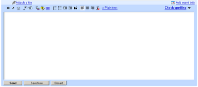
The Gmail interface:
The Gmail text entry widget actually has 2 modes, "Plain text" and the one you can see above which is the "Rich text" editor. Now that's a rich joke :)
The duel-mode operation makes a lot of sense for emails and I have no quarrel with it - on the contrary, I would not use Gmail if it only let me send HTML emails!
But if you think the Gmail "Rich text" editor looks a lot like the blogger one, you'd be right. For some reason the problems I saw with the Blogger buttons don't happen on the Gmail interface, but that's about the only positive thing I can say for the Gmail interface - it's as feature-lacking as the Blogger one. Worse, it doesn't even give you the option of directly editing the HTML, leaving the power-user stuck without any options...
The Gmail spell-checker allows you to chooser a language to check, the Blogger one does not.
The Gmail icon for "Remove Formatting" is an underlined "T" with a red "x" at the bottom, the Blogger one is a small eraser. Go figure...
There are a few other differences (text color/font handling, picture insertion), I won't list them all here. The point is, for two interfaces which share almost the same function, these differences are annoying and puzzling. Plus, the general lack of advanced editing features in both makes them less usable, at least in my eyes.
The Writely interface:
I haven't signed-up for
Writely, so all I'm writing here is based on this screenshot which is available on the
writely.com front page, and from the "Tour" you can take, also from the front-page.
Writely bills itself as the "Web Word Processor", so I would expect it to be more feature-rich then the basic interfaces Gmail and Blogger offer. Based on the screenshot, it's obvious this is true. After going through the "Tour", I was also impressed that
Writely offers many if not all of the commonly used "Word Processing" options that I use when writing a "rich document" (as opposed to a "text document").
In addition to all of its bells and whistles,
Writely also seems to have the ability to publish directly to a blog, so I guess you could just stop using the Blogger interface and write all your blog posts from there. I think I'll do just that :)
But if
Writely is so great, why force the user to go to another site and register yet again, simply to use functionality that should have been
available in the first place? Why not standardise on the
Writely interface for all the sites? Sure, some options would remain unique to one service and not the other - for an email, you
attach files and
send the email. For a blog, you may want to
preview your work before
publishing it. But there's no excuse* for the many differences which currently exist between the three interfaces, differences which have no reason, as the interfaces belong to products of the same company and which have many
similar or even identical goals!
As always, your comments are welcome. Especially of any Google employees :)
* Well there is the excuse, the products are free, and I guess you get what you pay for. But that is a poor excuse at best... (pun intended :))


